As the year of our 100th anniversary draws to a close, we take a look at the colours that are goin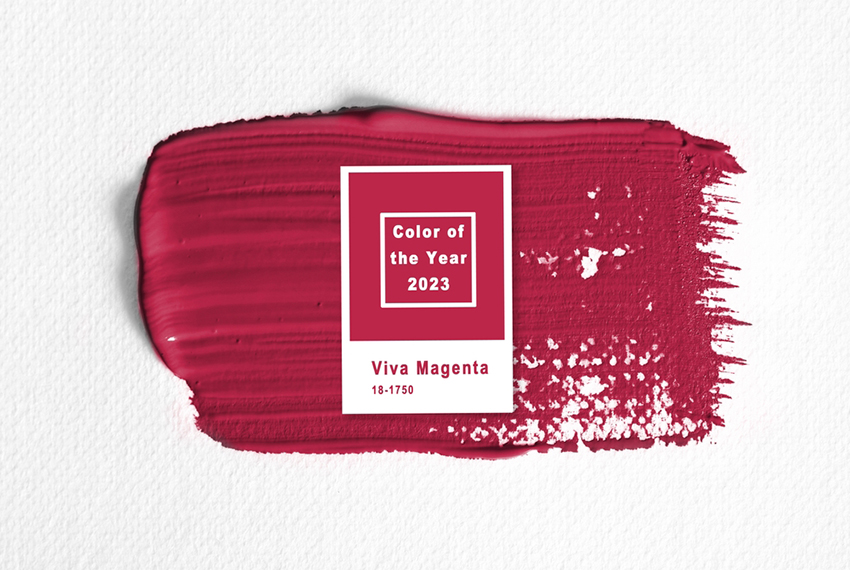 g to shape interiors trends over the coming years…
Pantone has announced its colour of the year and it’s not for the faint-hearted. Indeed, as Pantone itself says, Viva Magenta positively vibrates with vim and vigour.

Inspired by nature, it’s a crimson tone that balances warm and cool. Laura Pressman, vice president of the Pantone Color Institute, has said that – after years of soft and soothing colours – Viva Magenta represents reassurance, confidence and connection in a world trying to get back on its feet.
It’s certainly a statement-making shade that would look fantastic on walls or cabinetry in a kitchen. One striking way to use bold shades, such as Viva Magenta, is to paint the inside of glass-fronted cabinets.
That way you get a splash of colour without it dominating the entire room.
Rugs, throws, cushions and crockery offer another great way to introduce a small splash of this colour into your décor. Also, look for tiles that have a little magenta in the overall design. That way you’ll get a contemporary look without feeling overwhelmed. Painting a bay in a bright shade such as this also works well if you’re planning to use it as a reading nook or want to house a desk in it.
The move away from white door trims and skirting will also continue, with darker contrasting shades – or even slightly jarring brights – used in place of the standard white. This will open up the palette and give the opportunity to use a colour you might not otherwise choose.
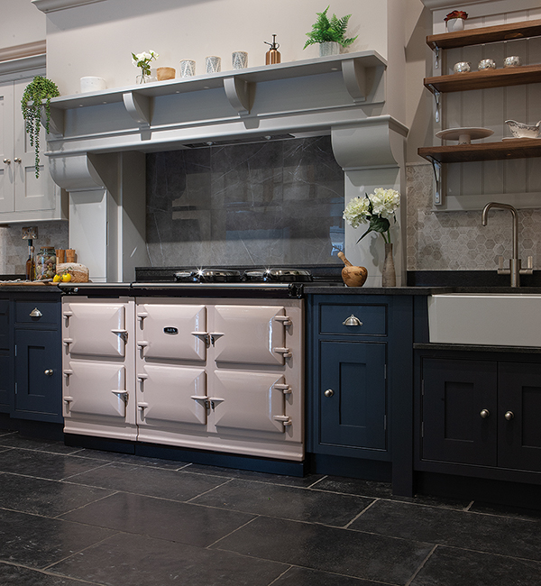
AGA colours that Viva Magenta work well with include Blush, Pearl Ashes, Dove, Cream, Linen and White. We particularly like the way it contrasts with Blush, as it gives a look that is both timeless and very of the moment. It’s a look you won’t tire of.
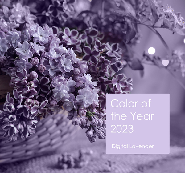
Trends forecaster WGSN has settled on Digital Lavender as its colour of the year for 2023. It says: “Purple will return as a key colour, representing wellness and digital escapism. Recuperative rituals will become a top priority for consumers who want to protect and improve their mental health.” 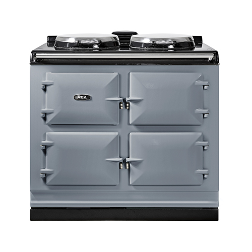
Digital Lavender is a subtler shade that would work well as a kitchen wall colour. When it comes to AGA colours, it would work particularly well with Olivine, British Racing Green, Pearl Ashes, Dove, Pewter and Aubergine.
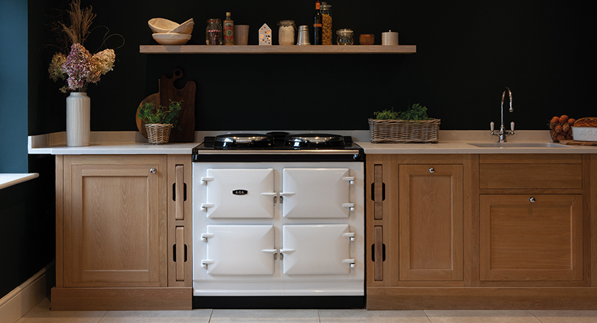 Other colours we’ll be seeing a lot more of include very dark greens. Neptune’s latest shade, Constable Green, is a perfect example of this. Inspired by the rich blue-greens of a Constable painting, it was based on a shade created in collaboration with artist Lucy Mayes of London Pigment. It looks fantastic against natural wood and crisp white accents.
Yellow, too, is set to become big again, particularly when used with greens. If you’re looking to add a pop of colour, then the Rayburn Ranger cooker model in Sunshine is the perfect bright yellow to use alongside forest-inspired shades. 
On that note, as biophilic design looks set to become one of the biggest interior design trends of the coming decade, shades that work well with houseplants will also continue to become ever more popular. We’ll be seeing more of soft whites, earthier pinks and even rich browns, as well as greens and blues used together.


